
Table of Contents
Lessons from Historical Logos: What Timeless Design Looks Like
In a world where brands are constantly competing for attention, it’s easy to forget that some of the most iconic logos in history have remained relatively unchanged for decades. From Coca-Cola’s classic script to Apple’s minimalist apple, these logos have stood the test of time. What makes them so effective? What lessons can modern businesses learn from these timeless designs? In this article, we’ll explore key lessons from historical logos and how you can apply them to your own brand identity today.
The Power of Simplicity
One of the most obvious yet important lessons from historical logos is the value of simplicity. Let’s take a look at some of the most iconic logos:
Nike’s Swoosh
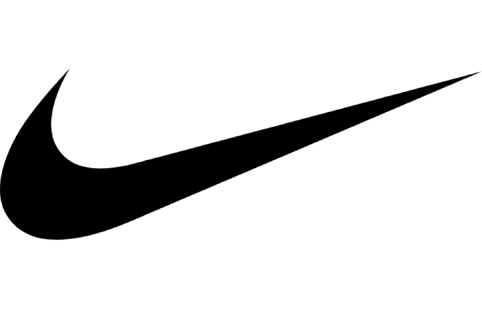
Nike’s swoosh is one of the simplest and most recognizable logos in the world. It’s just a curved line, yet it conveys speed, motion, and athleticism. The simplicity of the swoosh allows for maximum versatility across different platforms and mediums. Whether it’s on a sneaker, billboard, or social media post, the Nike logo is instantly identifiable.
Lesson: A simple design is flexible, memorable, and easy to reproduce. In an age of digital overload, a straightforward logo can cut through the noise.
Apple’s Apple
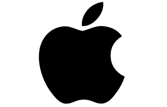
Apple’s logo has gone through minimal changes since its debut in 1977. The logo, a clean silhouette of an apple with a bite taken out, represents knowledge, simplicity, and innovation. Its smooth lines and minimalistic design make it adaptable to any size or color scheme. The bite is symbolic — easy to recognize, and it has an association with the biblical tale of Adam and Eve, signifying knowledge and the start of a new era in computing.
Lesson: A logo should encapsulate a brand’s identity in a simple yet meaningful way. Strong symbolism paired with a minimalist design ensures lasting power.
Flexibility Across Mediums
One of the reasons some historical logos are so effective is their flexibility across different media and environments. Let’s consider the example of Coca-Cola:
Coca-Cola’s Script
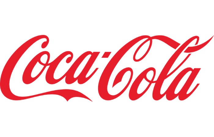
Coca-Cola’s logo is recognized globally, and its handwritten script remains unchanged since its creation in 1886. Whether it’s on a billboard, a bottle, or a digital advertisement, the cursive script retains its charm and legibility. The red and white color scheme is equally versatile and remains one of the most recognizable color combinations in the world. For brands aiming to achieve similar timeless recognition, it’s crucial to thoughtfully design a business logo that reflects identity and endures across generations.
Lesson: Timeless logos are versatile and scale well across all mediums. Whether it’s a website, a social media ad, or a physical product, a great logo is legible and maintains its visual integrity in any context.
Memorable and Unique
Another key feature of iconic logos is their ability to be memorable. When people see a logo, they should immediately associate it with the brand. Take McDonald’s for example:
McDonald’s Golden Arches

The golden arches of McDonald’s are instantly recognizable worldwide. The simplicity and boldness of the arches allow them to stand out and remain memorable, even when scaled down for mobile apps or restaurant signage. The logo has evolved in terms of color and presentation, but its core shape remains unchanged.
Lesson: A logo must be distinctive enough to be memorable and recognizable in an instant. Strive for uniqueness while maintaining simplicity. The best logos stand out even in a crowded marketplace.
Consistency is Key
Historical logos have thrived because they’ve been consistent over time. They haven’t undergone drastic changes that confuse the audience. Think about Pepsi, for example:
Pepsi’s Iconic Globe

Pepsi’s logo has undergone numerous redesigns, but its core idea – the globe – has remained constant. The globe was introduced in 1958 and has been modernized in various ways throughout the decades. The colors have shifted, the font has changed, but the globe symbol remains, ensuring brand continuity.
Lesson: While a brand’s needs may evolve, consistency in your logo is key to maintaining customer loyalty and recognition. A logo should serve as a reliable symbol that connects the past with the future.
How Historical Logos Adapt to Modern Trends
Some might argue that the old logos, with their simplicity and bold shapes, wouldn’t work in today’s digital landscape. However, these designs have adapted over time to remain relevant. Let’s explore how Starbucks and Volkswagen have managed this:
Starbucks: From Detailed Seal to Modern Minimalism
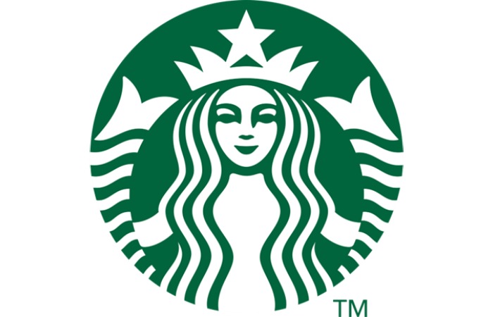
Starbucks originally had a highly detailed logo featuring a twin-tailed mermaid. Over time, the logo was simplified, especially as the company grew its digital presence. The current Starbucks logo is a green circular seal featuring a simplified mermaid, making it ideal for mobile and app displays, while still maintaining its rich brand history.
Volkswagen: Timeless Simplicity

Volkswagen’s logo, featuring the interlocking V and W, has remained relatively unchanged for decades. However, recent updates have modernized its look, making it more versatile and suited for digital platforms while staying true to its classic design.
Lesson: Great logos don’t resist change — they evolve to fit modern needs while maintaining their original charm. Whether through digital platforms or minimalist designs, the most successful logos adapt while staying rooted in their history.
When to Evolve Your Logo
As we’ve seen with companies like Starbucks, Apple, and Coca-Cola, evolution is a natural part of a brand’s journey. But there’s a right way to approach logo evolution. Here are a few things to consider before making changes:
- Know When It’s Necessary: Don’t change your logo simply to keep up with trends. If your logo still communicates your brand’s values and connects with your audience, there’s no need for a redesign.
- Consider Subtle Tweaks: Minor adjustments — like updating fonts or refining color palettes — can refresh a logo without losing its identity.
- Stay True to Your Core Message: Any changes you make should align with your brand’s mission, values, and target audience. Your logo is a visual representation of your brand — it must reflect what your business stands for.
Bringing It All Together: Key Takeaways
To design a timeless logo, there are several important lessons to keep in mind:
- Simplicity should be your guiding principle. Avoid unnecessary complexity that can detract from your logo’s message.
- Flexibility ensures your logo performs well across all mediums and contexts, whether it’s a mobile screen, a storefront, or a social media ad.
- Memorability is crucial — aim for a design that’s instantly recognizable and stands out from the crowd.
- Consistency over time fosters trust and brand loyalty. Ensure your logo remains steady as your company evolves.
- Adaptability allows your logo to remain relevant in an ever-changing digital landscape.
By embracing these timeless principles from historical logos, you can create a brand identity that resonates with your audience and stands the test of time. Your logo is much more than just an image — it’s a powerful communication tool that conveys the essence of your brand.